L O G O D E S I G N


Logo Simplification task
An assignment while at Yoobee Colleges; to take an exisiting logo and simplify it.
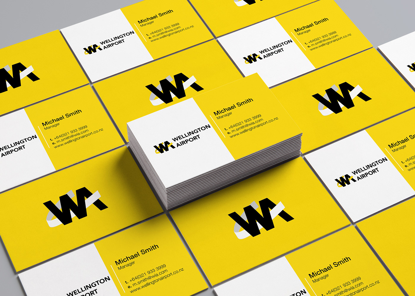
My chosen client was Wellington Airport.
I set about researching my client; from their current signage to their 2040 vision. They have a huge vision of expansion, including extending the runway to allow for large international planes to land. So I knew I had to design something professional and memorable.
My design went through a number of iterations, with feedback helping me to get to this final design. Wellington is well known as the 'windy capital' and for its creative and eclectic vibe. Therefore, I set out to incorporate wind, creativity and corporate styles.
My final design used the letters 'W' and 'A' , with a simple swish finishing off the 'A'. This swish is to represent planes taking off, a passenger embarking on a journey and also the wind of the city. The yellow is Wellingtons known colour and represents creativity.
Thanks for looking.
Brittany.